
There was a time when technology was emerging and computers were invented. By the time Internet came into existence, it was confined to desktops only. Now we are in a space where everyone is surrounded by gadgets and equipment, such as desktops, laptops, smart phones, tablets etc. If today we develop a website, it should without any question work on all these gadgets. Developing a website that smoothly works on all these gadgets is the responsive web design.
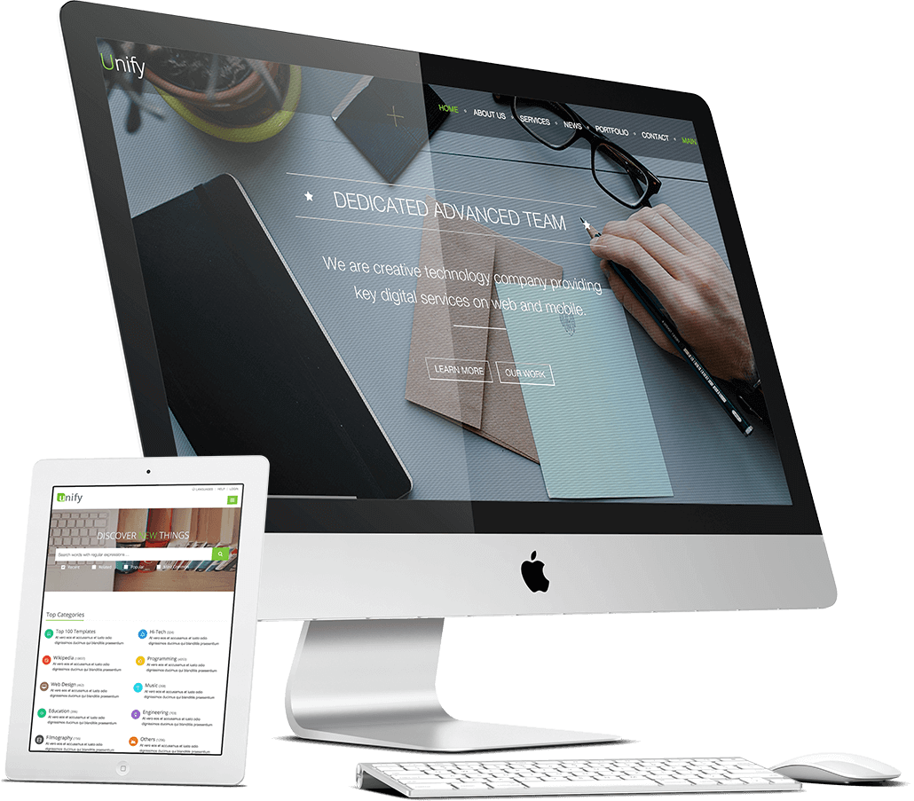
Technically, Responsive Web Design is the approach undertaken during web designing, which suggests that the website design and development should be responsive to the user’s behavior based on the screen size, orientation and platform of devices. Responsive Web Design will make your web page be in resonance with all devices (desktops, laptops, tablets and phones) and also look good at the same time on whichever platform it is working. Responsive Web Design also provides users with an optimal viewing capability on all devices and enables your website visitors with enhanced user experience.
You will be surprised to know that there is exponential growth in the use of mobile devices and responsive websites but most of the businesses do not have such websites. On the other hand, most of the internet traffic is now coming from mobile devices and hence it has become essential to build a mobile-friendly website.
When there was no concept of responsive web design, only one approach was followed – one size fits all. This was because most of the people had only desktops or laptops to access the Internet and view a website.
When smart phones and tablets were introduced, the websites built did not open on these devices and they needed to zoom in the text to read it or click links given on the website. Hence a non- responsive website led to an irritating user experience and as a result number of people chose to leave the website in no time or switched to the mobile-friendly websites.
|
%age of users |
What users’ said… |
|
48 |
“We got frustrated and annoyed when the site was not mobile-friendly” |
|
36 |
“We have wasted out our time by visiting those websites” |
|
52 |
“We did not engage with the company due to a bad mobile experience” |
|
48 |
“If a site didn’t work well on our smart phones, we felt like the company didn’t care about their business” |
If you do not have a mobile-friendly or a responsive website in this competitive world of online marketing, you are making a huge negative difference between you and your competitors.

A mobile-friendly or a responsive website is an essential ingredient for providing a good experience to your users or website visitors and it is also a crucial part of a sound search engine optimization (SEO) strategy. You would be surprised to know that more than 2 out of 10 of Google searches are done from a mobile device and this is the reason why Google has launched mobile-friendly badges in the search results to help navigate users on mobile devices.
Due to the higher use of mobile devices, the businesses are getting routed more through these smart phones. If there is an increased proportion of traffic via a certain medium, it will obviously result in increase in sales and provide your business wings to fly. Hence it becomes increasingly important to run your business from a mobile-friendly website.
These days most of the shopping is done through e-commerce websites and hence it becomes particularly beneficial for such websites to provide their users with mobile-friendly shopping cart to make the checkout process more intuitive. This in turn provides the companies with an increased conversion rate. As per the study conducted by eConsultancy, more than 60% of the companies had increased sales that had a mobile-friendly website.
Whether you already have a website or you are planning to get one, adding a mobile-friendly and responsive feature to it is a must. Partnering with a professional web design and development company like 99 App Technologies would be a wise decision for designing a mobile-friendly website. We specialise in designing responsive and mobile-friendly websites and have a team of experienced website designers and developers. We assure you that you will provide your users with an optimal mobile user experience if you hire us for designing a mobile-friendly website for your business. You can Call or email us to discuss your business website requirements. We have experienced website designers who can help you move your business ahead with a mobile-friendly website.
We’ll help to achieve your goals and to grow business
+91 99 9080 1843
Thank you very much 99 App Technology. Logo design looking good I will give you more work
Thank you so much for your efforts to make my website very beautiful and professional. 99 APP Technologies
99 App Technologies is great! Big thanks to their expert work and professionalism. It’s helped us with our SEO,Web Design, Graphic Design.
Thank you very much for creating a fantastic website for us. I deeply appreciate your efforts and guidance, without which, this wouldn’t have been possible thanks 99 App Tech.
99 App Technologies serve many services some technology see below...